Top tips for better print design – Part 1
06th Oct 20151. Step outside of the norm
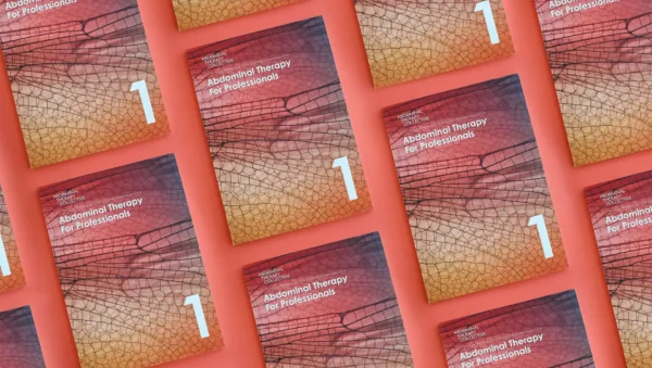
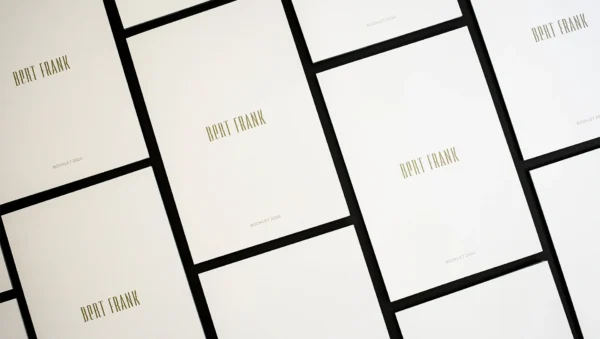
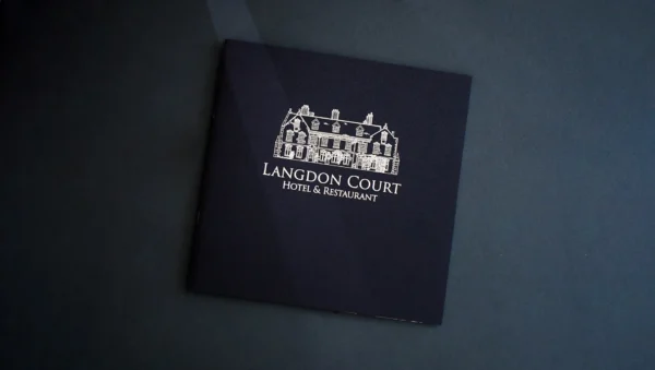
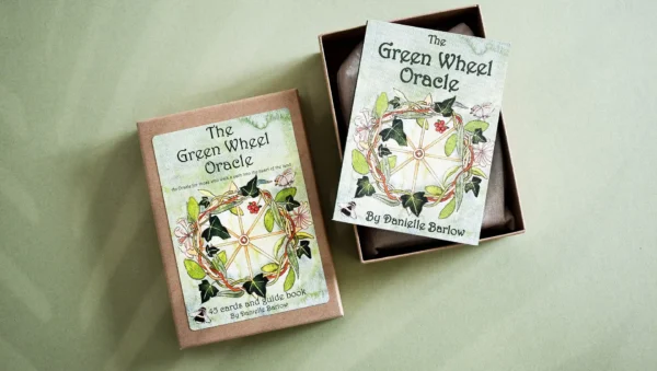
A4 is often seen as the ‘accepted’ standard size when printing, but don’t get caught up in what everyone else is doing. Try experimenting with different sizes – smaller sizes can easily fit in handbags and are less cumbersome for people to carry in their hands, whilst square booklets can really stand out from the crowd on a display stand.
2. Borders aren’t boring
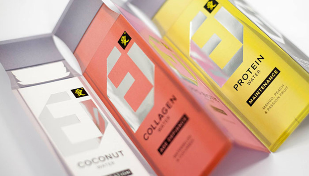
Don’t be scared to experiment with going outside the border. The Human brain is capable of seeing the ‘bigger picture’ – for example, if you cut a quarter or half of the first and last letters off a word, our minds are still able to figure out what the word is. This way your message won’t just get lost in a sea of paper, but will instead be the first thing people see and hopefully pick up.
3. Content is king
You can have the best printer in the world, but without high quality photographic content or catchy, well written text, your design will never be given the attention it deserves. Don’t be scared of filters for your images or funky fonts either; remember, design is supposed to be full of creative flair, so go all out and create something amazing. Think of your design as food; you won’t get haute cuisine with second-rate ingredients!
4. Bleeding is a good thing!
Now don’t rush for your plasters, this kind of bleeding is the small area on the side of your document that allows your printer to work around any inconsistencies in the paper or design. This is necessary because with the best will in the world, a printer may not always get everything 100% ‘square’, so a small bleed area allows for these errors. Once printing is finished, the bleed area will be trimmed off, meaning your design looks just as you intended! We generally recommend a 3mm bleed area for best results.
5. Grab a grid
Grids are a really easy way to get a stunning finish, with very little effort. Don’t just plump for a standard 2 or 3 column set up though, try experimenting with 5, or 7 column grid for some really creative opportunities. Remember, they don’t all have to be the same size, if you can have a mix of different size columns in your design, you can easily create something very eye catching that will be a real talking point!
We hope that you have found some inspiration in this, the first of two guides to better design for print. Let us know if you have found this useful, or add your own tips in the comments below! Look out for part two of our guide coming soon, or join our email newsletter list to receive new blogs and tips every month.
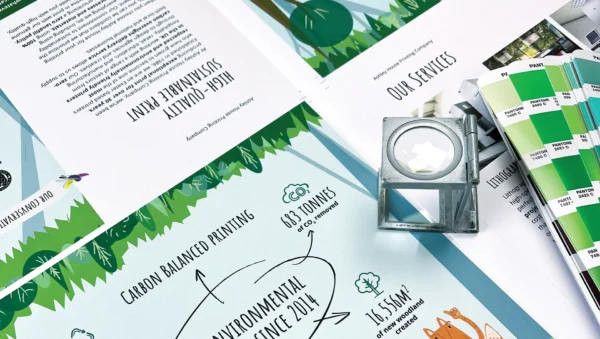
Check out our Print Portfolio Page for some inspiration.
