Seven graphic design trends to look out for in 2017
01st Mar 2017With 2017 now in full swing, we take a look at the design trends that are coming to the forefront for 2017. With our 7 trends to look out for, you can consider what you’ll be looking to adopt, and how they can work for you.
1. Modern retro
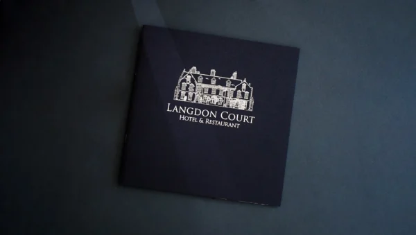
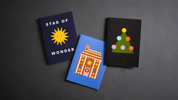
You will no doubt recognise this one from 2016, updating retro typefaces and colour palettes with a modern touch. It’s, understandably, a classic look, which is perhaps why it has been so popular over the last year. We expect to see its popularity continue to grow over 2017, giving a sense of timelessness to everything it graces.
2. Minimalism
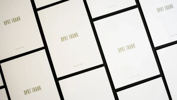
‘Less is more’ is a concept graphic designers find themselves coming back to time and time again. With minimalism, this idea is at the core of its style, which is based on a simple and functional approach to design, reducing the clutter, and allowing the onlooker to focus on what’s important in the graphic. Minimalism has been around since the early 20th century, if not longer, and it certainly looks like it will be staying for 2017.
3. Hand-drawn illustrations
Hand-drawn illustrations are great for explaining all kinds of situations, scenarios, and instructions via an approach that can appear more bespoke. The human touch they give to a graphic can give it an organic feel, and can often create a nostalgic and child-like quality. In 2017, we expect to see even more of these illustrations.
4. More layering of elements
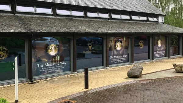
The art of the overlap, when done right, can produce a fantastic contemporary design. Three-dimensional concepts can also used in a graphic design for a professional result. The layering approach should look realistic and intentional if you’re going to pull it off too.
5. Gradients
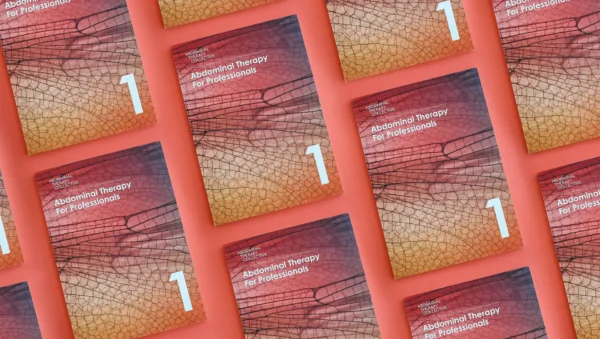
When used in a way that is fitting with the rest of the design, gradients can add depth in a way other techniques can’t achieve, which explains the resurgence in their popularity. Having been packed away with flat design, gradients are back, offering bright colours and two-tone overlay once more.
6. Oversized typography
With attention spans at an all-time low, huge typography is a sure-fire way to grab an audience’s attention quickly and keep a firm hold of it. Large lettering is becoming a proven tool among designers for communicating messages, who are also adding visual flourishes, including dashes of novelty or vintage flair to catch a user’s eye.
7. Intense and heightened colours
When catching someone’s eye, what better way to do it than with a striking colour palette? 2016 has seen designers make a departure from subtle, muted tones towards big, bold colours, including pastels, neons, and primary colours, packing designs with a punch and giving onlookers something to remember. We expect this trend to continue through 2017.
In Summary
The most successful design approaches are those with versatility and that can be used in various design combinations, as well as not completely changing the original, but instead updating it, and by making just one change at a time.
Get in touch
If you’re looking for a print partner that is as passionate about great design as you are, get in touch or call us on 01392 202320.
