The emotional power of colour
28th Sep 2015Psychologists have known for many years that people respond in an emotional way to different colours. The fact that red feels vibrant, passionate and exciting, whereas white feels peaceful, pure and sterile will be a surprise to no one. What is not so often considered, though, is the way that brands can use the emotional power of colours to connect with their customers and communicate messages in far more subtle ways.
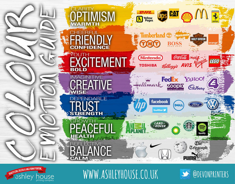
We have compiled a graphic below showing how leading companies are using the emotional power of colour to communicate the personality of their company. Other companies like Google have sought to ‘cover all the bases’ by using a range of bold colours.
How do your corporate colours fit into this? Are you communicating the right personality for your company with your marketing colour choices?
Brilliant colours at Ashley House
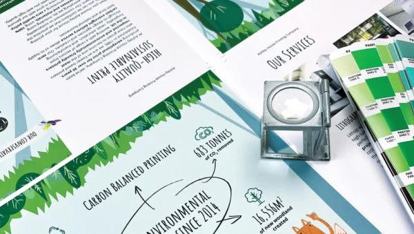
At Ashley House we understand the power of colour, and are able to offer expert advice on how to ensure that your branding and print materials have the emotional impact that you seek. We have decades of experience in ensuring that the print we produce has true, vibrant colours across any format and paper stock. Our HP Indigo digital press produces an unbeatable depth of colour, that far exceeds what had been possible in digital printing.
Ask us how we can help you to create print that really moves your customers to action.
