Graphic design trends for 2018
26th Jan 2018Design trends are constantly changing, so it’s important to stay in the know with the latest trends to ensure your print doesn’t become outdated. To kick start the new year, we’re taking a look at the top graphic design trends to look out for in 2018 to ensure your print makes an impact.
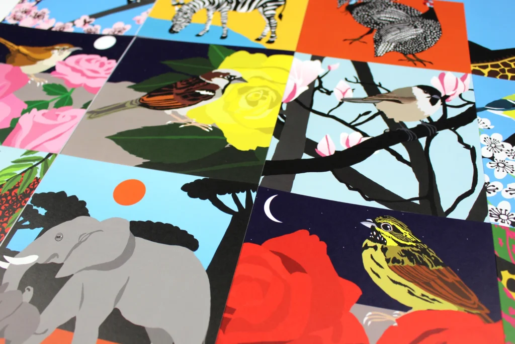
Big, Bold, Bright Colours
Much like last year, bright colour palettes will overrule neutral tones. Whether you use colour sparingly or drastically, even adding the smallest pop of colour to your print can help you stand out from the crowd. Think statement colours, neon, retro palettes, contrasting colours… the brighter the better!
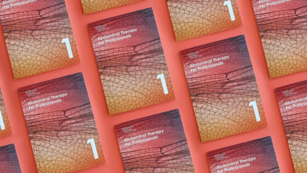
Gradient & Colour Transitions
Say goodbye to flat colours and hello to gradients and transitions. Many brands embraced this trend in 2017 and its popularity is set to continue in 2018. The great thing about it, is it’s easy to do and can be used in most areas of design – logos, backgrounds, typography, the list is endless.
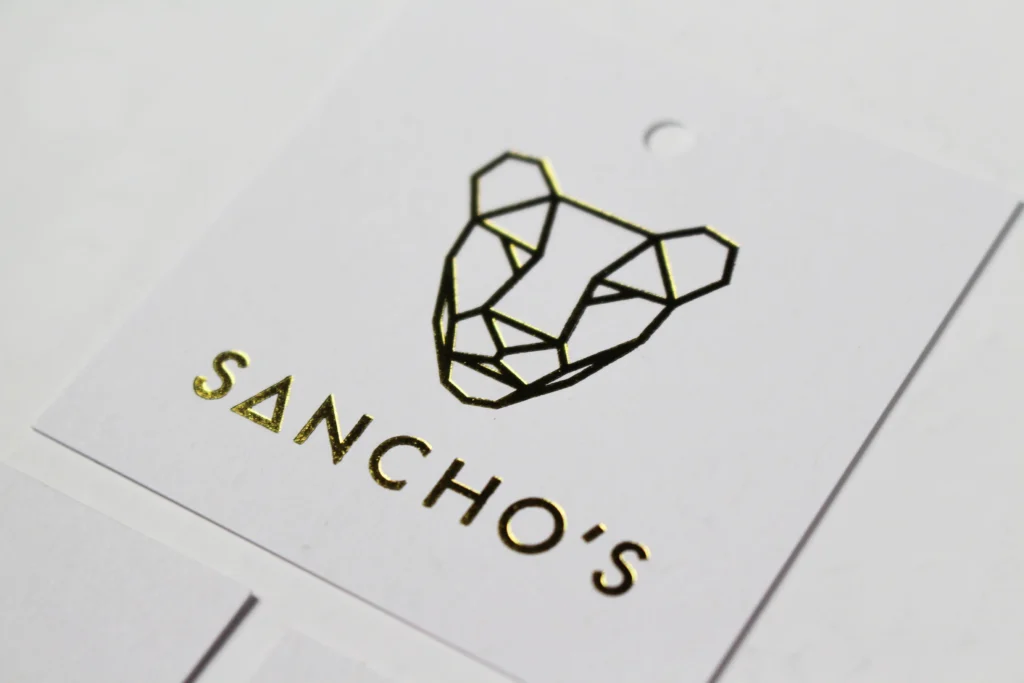
Metallic Elements
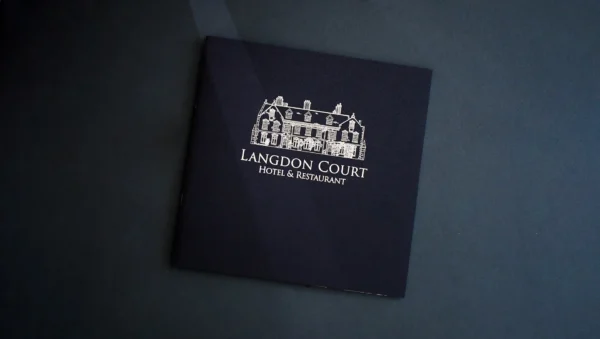
If bright colours aren’t your thing, metallics are a great alternative. The injection of a metallic element can really add a touch of luxury to a piece and really make it stand out. Don’t just settle for gold or silver, modern metallics like rose gold and copper are everywhere right now. Try experimenting with metallic elements in your print to really give it the wow factor!
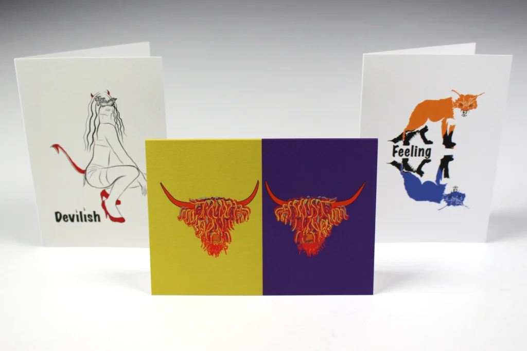
Hand-drawn Illustration
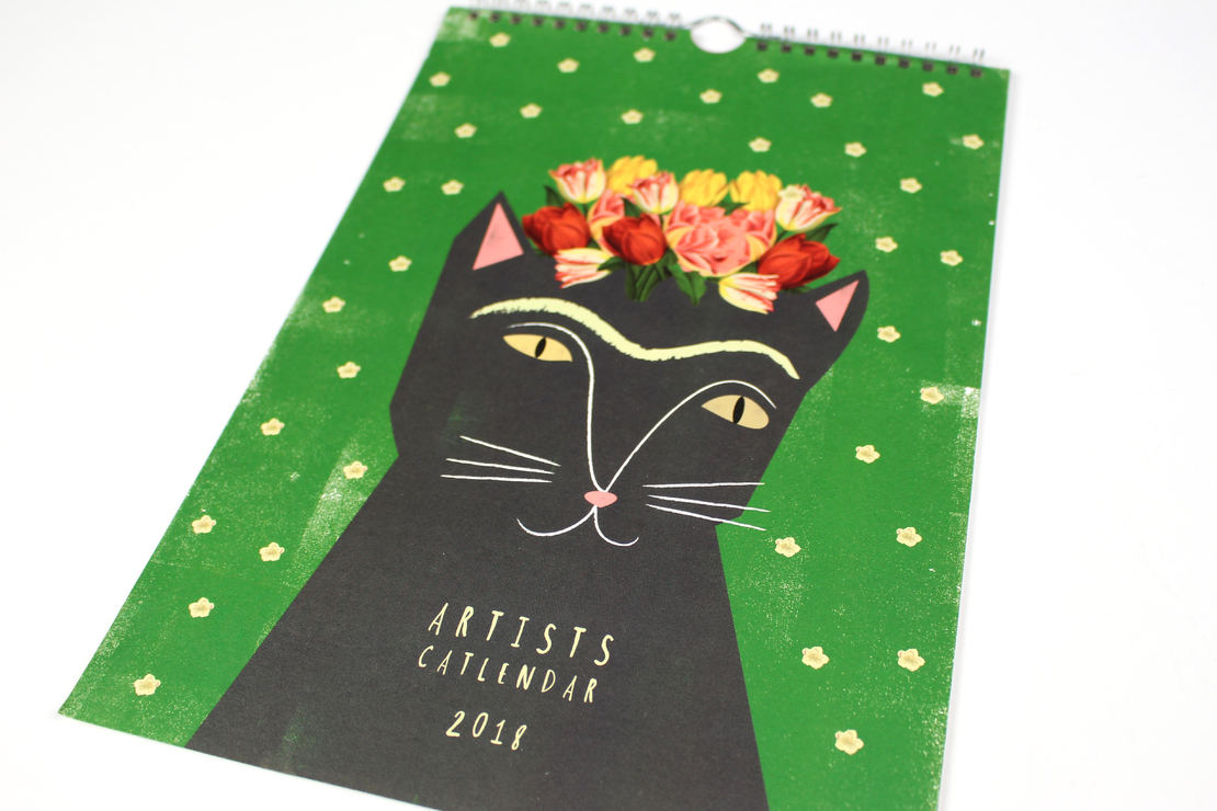
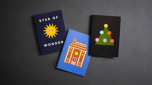
This year we’ll see less stock imagery and more custom, hand-drawn illustration. Whether you replace photography with illustrations, use handcrafted typography, or use illustration as a creative overlay on photos, the best thing about hand-drawn illustration is that it can work for almost any product or service and is a great way to portray your brand as original and unique.
Double Elements
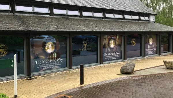
Duo tone, double light, double exposure – the year of double! Many big names used double techniques in late 2017, giving prominence to this trend. ‘Double’ design trends are a great way of injecting an artistic flare to your design and these techniques are great for creating modern looking imagery with a futuristic feel. Expect to see a lot of this in 2018!
Geometric Shapes
The use of geometric shapes has been an ongoing trend and isn’t going away anytime soon. Combining the use of geometric shapes with other design elements is a great way to create strong visuals. Experiment with different textures or materials to make your geometric shapes eye catching – embossing, foil, metallics, spot gloss are all great ways to do this.
Creative Photography
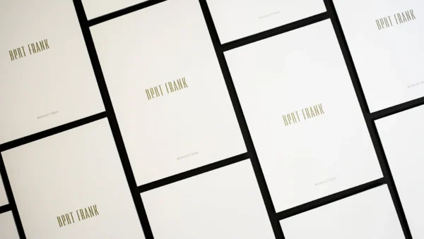
Typography is set to get bigger and bolder, with the most popular use of types being cropped and chaotic. The art of removing sections of letters but still being legible to the reader, and the un-alignment of text, say no to convention and shake up the typography on your page – a great way of engaging the reader.
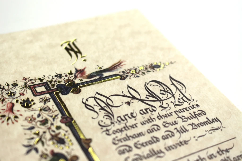
Whereas last year’s trends gave focus to minimalism, 2018 is the year to get creative with your print and start showing off your artistic side. You don’t need to incorporate all of the current trends into your design, it’s important to pick out the ones that could work for you and regularly refresh your print to ensure it remains current.
Get In Touch
If you’re still unsure where to start, we can provide a complete graphic design service. From concept to print, we work with you to understand your business and what you want to achieve. Call us on 01392 202320 and tell us what you have in mind and we’ll be delighted to help.
